Saturday, December 10, 2011

Rocks! Waterfall! (Work in progress)

     Now that I've had my floral break, I'm back to working on another rocks and waterfall painting. This one is a conglomerate of two shots I took somewhere out west -- Yellowstone, maybe. It's about half done, and I'm chipping away at it during the Tuesday afternoon watercolor class I teach in Kettering, Ohio.
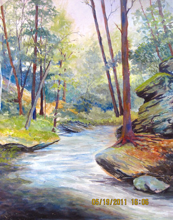
     I started this with the intention of doing a pen and ink drawing, then over-painting with watercolor. That idea lasted through the first session, and you can see evidence of this beginning in a couple sections. During the second session, I laid in the sky and distant background. Last Tuesday I worked on the rocks on the middle and lower right, and I started indicating the flow of the water.
     If you're interested in technique, you can see where I've used coarse table salt in the rocks on the lower right. It gives some interesting texture, though I'll probably paint over some of it. It would look too odd to have it only in that one section of the painting.
     Keep watching this blog, and you'll see how the painting develops.


Thursday, December 8, 2011

Red Daylilies


Being heartily tired of rocks and waterfalls, I decided to do a floral. Here's my attempt to capture the brilliance of my husband's red daylilies.
It's transparent watercolor on an eighth sheet of Arches hot press watercolor paper.

Thursday, November 3, 2011

Rocky Stream: Finished!

"Rocky Stream" c2011 Susan Bertke
After spending an afternoon fiddling with the little details, I've declared this painting finished! 

Unlike the other paintings I've been working on the last couple of months, this one is pure transparent watercolor. The technique has been heavy on dry brushing to get textures and shadows. That's a very careful, tedious way to keep control of watercolor. Except for the very first wash, there was very little wet-into-wet painting in this one.
I've finally identified the reference photo as one I took from the back of a motel just outside of Yosemite National Bank. 

Give me your comments!

Saturday, October 29, 2011

Stream: Work in Progress #2

     I've been fiddling with this painting since I posted the first stage in September. If you compare the two, you'll see that I've added another layer of shadow on many of the foreground rocks. I've also given more definition to the trees on the left and added softer definition to the more distant trees on the top right.
     Unlike the previous two paintings, this work is pure transparent watercolor, since I'm using it as a demo painting for my Tuesday afternoon watercolor class in Kettering. I'm in no hurry to finish, and I think it's about 85% there. I mostly want to work in the lower left quarter. The little bit of white water needs to be detailed, and some fine detail added to the rocks immediately around it.
     Anyone see anything else I should do to it? Comments welcome!

Friday, October 28, 2011

Cedar Falls -- Completed?


Cedar Falls (c) 2011 Susan Bertke
 You saw the beginning stages of this watercolor on September 2nd. I think it's finally finished. (Or as "finished" was my paintings ever are. The longer they sit around my studio, the more likely I am to go back and fiddle with them.)

That dadgum waterfall has been driving me crazy since my last post. I can't tell you how many variations I've painted. Watercolor purists maintain that the only white in the painting should be the original white of the paper. Early on, it became clear that this would not be a pure transparent watercolor. I ended up overworking fairly extensively with gouache (opaque watercolor).

The trick to combining transparent and opaque watercolor is to do so in a way that seems intentional. It should look like the opaque bits were intended from the beginning, not desperate attempts to cover up mistakes. Since I took Chris Leeper's workshop, I've been a lot more relaxed about the idea of mixing watercolor with either acrylic or gouache. It's helped my transparent work, I think, because I'm a lot more relaxed in the beginning stages of a painting. I think, "Oh, I can be a little more adventurous about my colors, because I can always use this as an underpainting if I don't like the result."

The finished size is about 14"x20" on Arches 140-lb. watercolor paper.

Thursday, October 27, 2011

Braided Stream


Braided Stream (c) 2011 Susan Bertke
 Here's the completed version of "Braided Stream." (If you look at my previous post, you'll see the underpainting.)

The background hills gave me the most grief in this painting. I vowed I was going to keep them a bit out of focus so the center of interest would stay in the foreground. But I went back to make "just a few corrections," and the next thing I knew I was painting individual branches on trees! So then I had to go back and paint over most of that detail. :-)

I'm happy with the texture I got in the foreground, especially all the gravel and stones. And the bark of the trees came out nice, too. The really tricky part was the water, or rather showing the mud and stones under the surface of the water.

The painting is done in acrylic on Arches 140-lb. watercolor paper, 14"x20".

Leave a comment and let me know what you think.

Monday, October 17, 2011

Braided Stream - Work in Progress

I started this painting during the Brown Bagger session last Monday and haven't done a thing with it since then. It's acrylic on paper, and definitely is just the beginning step. Watch here for future progress...

Thursday, October 6, 2011

"Summer Woods"

"Summer Woods" by Susan Bertke (c) 2011
When I started this painting at the first Brown Bagger session at Rosewood Art Centre, I shocked everyone by working on an Arches watercolor block instead of a canvas. Coming from a watercolor background, it seemed perfectly normal to me! I see several advantages to working on a good quality rag paper:
  • I'm not crazy about the woven texture of canvas, especially when I'm working with thin glazes. And watercolor paper comes in three different finishes (hot-press, cold-press, and rough).
  • It gives me the option of starting the painting with watercolor or acrylic thinned to the consistency of watercolor -- which gives a transparency and luminosity that I haven't achieved with opaque media.
  • I have more framing options:
    1. Under glass with a mat (I'm not sure that having the glass in direct contact with the acrylic paint would be a good idea.) in a standard frame (not necessarily a canvas-deep frame).
    2. Framed with neither glass nor mat, so it looks more like a canvas work. 
    3. Dry-mounted to a support of some sort and hung without any frame at all. (I haven't tried this, but I'm sure someone has.) Chris Leeper actually mounts his paper to a board before he starts working.
That said, I have had one problem with working this way: for some reason acrylic washes seem to soak into the blank paper more than watercolor does. I can't imagine why this is so, but that's my experience. It's not a problem if I start with watercolor washes, or if I thoroughly pre-wet the paper.  So maybe I'm simply not using enough water in my acrylic washes. I also know that some artists prime their watercolor paper with gesso, gouache, or matte medium. Any of these would cut down on the absorbency of the paper.
Anyway, this painting is acrylic on Arches 140-lb cold-press watercolor paper, 14" x 20".

Monday, October 3, 2011

Name This Painting!

I've declared this painting completed, except for one thing--I don't know what to call it. Stream #2 (which is how it's filed on my computer) just doesn't do it for me. Any ideas?
For those who like to know, it is acrylic on 16x20-inch canvas board.

Monday, September 26, 2011

Yet another stream, closer to home: Work in Progress

I've started meeting with a group of "brown-baggers" once a week at Rosewood Art Centre in Kettering, OH. It's a very informal sort of class, and it is forcing me back into the studio. Since Jennifer works in acrylic, I've dug out my old paints and have been trying to recover my long forgotten brushwork skills. At first, everything felt very awkward and frustrating, but I felt like it was starting to come together for me with this painting.


The bottom quarter is mostly underpainting. I'm happy with the upper left quarter. The upper right corner is totally screwed up. In short, it's at a fairly typical stage of development with areas I like and areas I dislike. More work to be done...


This work is acrylic on canvas board, 18x24 inches. Oh, yeah, the reference photo was taken from Old Man's Cave in Hocking Hills State Park, Ohio. The instructor for the Brown Baggers is J. Austin Jennings http://2-artists.com/JAJ.htm 

Another Stream: Work in Progress

I'm still mining my stash of vacation photographs. I think the source photo for this painting was taken somewhere in Colorado, probably in the Keystone area, though it's the sort of picture that could have been snapped almost anywhere.


I'm working in transparent watercolor on a half sheet of Arches 140lb cold pressed paper. I want to keep the colors fresh, so I'm being a bit more cautious than usual with my washes.

I'd say this painting is about half done. It's mostly still underpainting.

Friday, September 2, 2011

Work in Progress: Cedar Falls

Cedar Falls (WIP) Copyright Susan Bertke, 2011
Once again I'm mining my photographs from Hocking Hills State Park in Ohio. I'd say this painting is about 80% complete. As usual, I see several things I'm not happy with. Most importantly, I don't think the waterfall, which is the headliner of this show, is convincing. And the fellow standing with his back to us seems stiff and unnatural.

This is a case where I have to let the painting hang for a while until I see the solution to the problems. If any of you have suggestions, I'm always interested in your feedback!

Thursday, May 19, 2011

At Chris Leeper's Workshop

      This was day three at Christopher Leeper's watermedia workshop in Kettering, Ohio. (Go to Chris' web site.)
     This is the first painting I did, Liquid Gold. It's done on a quarter sheet of Arches cold-pressed 140# watercolor paper. I began with an underpainting of transparent watercolor, then an overpainting of gouache (opaque watercolor). I was trying to capture the moment near sunset when the light hits that cliff and reflects into the stream. The water turns to molten gold, and my camera was totally unable to fully capture the effect. This is close. Reference photo was taken just outside of Yosemite National Park.


     This second painting is from a photo taken at Hocking Hills in southeast Ohio. Feeling a little braver, I worked on a half sheet of Arches CP 140# paper. This time I started with transparent watercolor and overpainted with acrylics.
     I'm trying to be bolder and more creative with my use of color and to loosen up my brushwork. 
     It's not really complete yet -- about 90% there. 
     (I'm unhappy that my husband's camera time stamped my photos. I'll have to figure how to turn that feature off!)

Tuesday, May 3, 2011

Little Rose

This little painting is about 4x6-inches on Lanaquarelle CP paper.
     The rose is from a photo reference, but the leaves were an exercise in negative painting and came out of my head.

Tuesday, April 26, 2011

Checking out my Blogger stats

Commissioned portrait in pastel,
(c) Susan Bertke
     This is my first experience with blogging (unless you count a few random Tweets). Since I've only received a few comments, and all of them from people I know, I wondered whether anyone else was looking at my efforts. So I checked the stats page that Blogger provides. To my surprise, I've had readers from as far away as Canada, Lebanon, Russia, and Honduras! How cool is that!
     So a big thank you to all those who have checked out the site. I hope you enjoyed it and will come back. Please feel free to follow and/or subscribe so you don't miss anything. And leave a comment just to say hello!
     I think I'll share something I did many years ago for a loyal client. Every time Ginny gets a new dog, she has me do its pastel portrait...
Susan

Saturday, April 23, 2011

Work in Progress: Hocking Hills Version 2

     The two trees on the left really bothered me, so I scrubbed them out. I liked the original bottom area, but decided it needed to be darker to balance the visual weight of the rocks on the right. I also touched up a few other things, notably the background forest.
     Sadly, I think I've lost the feeling of light at the end of the path, and the woods now just looks murky to me. The shadow under the middle clump of foliage on the left looks too straight and too exactly aligned with the shadow above it.

     Time to set this aside and let it simmer for a while.

Wednesday, April 20, 2011

Work in Progress: Hocking Hills

     My latest painting...
     Now that I've put this aside for a few days, I see several things I want to change. So it is still a work in progress.
      It is loosely based on a very old, faded photograph from a vacation I took at Hocking Hills State Park many years ago. 

Thursday, April 7, 2011

Autumn Still Life

This was originally a demo for a class and was done from an actual setup (as opposed to working from a photograph). I wasn't happy with it, so yesterday I pulled it out of my stack and gave it a thorough scrubbing until I had nothing but a faint ghost image. I spent a lot of time on the flowers, which was tricky since I was working from memory. I'm now much happier with the right side of this painting. 
     As for the left side, the less said, the better!  See that thing that looks like a white pear? I have no idea what that actually was. My best guess would be some kind of decorative gourd. Maybe if I just whack it off...
     Hah! When in doubt, crop it out!

Thursday, March 31, 2011

Work in Progress 4 (Finished?)

     I have reached the can't-stand-to-look-at-it-anymore stage, so I'm declaring it finished, at least for now. Maybe someday I'll go back and redo it, maybe in another medium besides watercolor. I could see this subject in pastel or acrylic.
     If anyone cares, the pigments used were Prussian blue, cobalt blue, Winsor yellow, hansa yellow, brown madder, and poppy red.
     If I don't sound enthused, it's because I'm not. It's rare for an artist to not find something to criticize in their own work. (I've heard that Leonardo da Vinci worked on the Mona Lisa seventeen years!) And right now my inner critic is pointing out all the areas that are overworked, ill-composed, poorly rendered, etc. You, on the other hand, are probably looking at it and thinking, "What, is she crazy? I wish I could paint like that!" But you are seeing it as it IS, not as it SHOULD BE. So which of us is right? Let me know.
 

Wednesday, March 30, 2011

Aargh!

     I take it back. When I composed and previewed the previous blog, there was a comment link at the bottom. But when I actually published it, POOF!
     Well, if you click on the little link that says "0 Comments," you'll get a pop-up comment window. (Sigh)

Yes, I want your comments!

     I've received a couple emails from friends who tell me they weren't able to comment on my blog. Evidently, I fiddled too much with the layout and must have screwed something up. For whatever reason, the comment box vanished. I think I've managed to get it back now. Let me know if you have trouble.
     And BTW, any other suggestions you might have to improve this blog will be gratefully considered. I'm SO new at this.

Tuesday, March 29, 2011

Work in Progress 3

     Every painting goes through an "ugly stage," at least in the mind of the artist.  The upper left corner of this one is definitely in that stage. I can't figure out how to deal with those d**n lacy ferns. I didn't like them as vague suggestions, and I like them even less as detailed images.
     I like the hints of orange I worked into the leaves on the right, but that color really needs to be carried over to the other parts of the painting...but how?
     It looks like I'll have to sleep on the problem and see if something occurs to me. This painting may be headed for my kitchen sprayer in the morning! (See previous blog "My latest painting" if you don't get the reference.)

Saturday, March 26, 2011

Work in Progress 2

     I'm feeling a bit better about this one today.
     I've discovered that Prussian Blue and Brown Madder make a nice black that can easily go either warm or cool by altering the proportions just a little. Add a little lemony yellow (in this case Winsor Yellow) and it becomes a very dark green.
     I started this painting because of a challenge in an online watercolor group -- to do a green painting without using green paint. But this is turning out overwhelming green. I need to pull in more warmth. Maybe I'll let the darks go more brownish red than I've done so far and see how that works.
     My other concern is that, when I did the initial underpainting, I lost all of the whites. Truthfully, there are no whites in my reference photo, but I may have to do some scrubbing or use some opaque white at the end, just to relieve my eye from all this yellow and green.

Friday, March 25, 2011

Work in Progress

I've barely begun this painting. This is mostly underpainting, and there are many, many layers to go. But at least I got into the studio today!

Tuesday, March 15, 2011

Let your light shine!

"Our deepest fear is not that we are inadequate.  Our deepest fear is that we are powerful beyond measure.  It is our light, not our darkness, that most frightens us.  We ask ourselves, who am I to be brilliant, gorgeous, talented, and fabulous?  Actually, who are you not to be?  You are a child of God. Your playing small doesn't serve the world.  There's nothing enlightened about shrinking so that other people won't feel insecure around you.  We are all meant to shine, as children do.  We are born to make manifest the glory of God that is within us.  It's not just in some of us, it's in everyone.  And as we let our own light shine, we unconsciously give other people permission to do the same.  As we are liberated from our own fear, our presence automatically liberates others." --Marianne Williamson
          Somewhere along the line, I developed the habit of responding to compliments with, "Thank you, but..." followed by a list of all the flaws in my accomplishment, or claims that I was just lucky, or my surprise that it turned out so well. One time a friend complimented me on something during a phone call, and I brushed it off. After I hung up the phone, I realized that I had so thoroughly dismissed his praise that I couldn't even remember what he had said!
          Enough! I made up my mind to answer all future compliments with a smile and a simple Thank You.
          For the most part, I remember.
          What started me on this self-destructive path? Simply, I wanted to be accepted by my school friends. I wanted to be one of them, and out-shining them did not seem to be a good way to accomplish that.  As the author says, I was "playing small" so others wouldn't "feel insecure" around me. The trouble is, after a few years of concerted self-deprecation, I believed what I was saying.
          Not good.
          This business of displaying our artistic "children" to the world is a complicated one. Too many artists have stacks of paintings, stories, sculptures, musical compositions, etc., hidden away somewhere, because they're "not good enough" to show publicly. It's not false modesty; it's genuine fear. Fear of rejection. Fear of ridicule. Fear of criticism. And, yes, fear of inadequacy. Hiding our light under the proverbial basket is our fragile Ego's way of trying to protect us.
          The trouble is, I believe we are here "to make manifest the glory of God that is within us." Hiding our talents, no matter how small we believe them to be, cannot be what God had in mind.

Saturday, March 5, 2011

My latest painting

White Petunias (c) 2011 Susan Bertke, watercolor 14x10"
I struggled with this painting off and on for a couple of months. Really. It was an exercise in trial and error. Lots of error. Several times I had to resort to my kitchen sink cure: take the painting to the kitchen sink, turn on the water full blast, and hit the trouble spots with the sprayer.
Isn't it strange that I've never seen that particular technique in any of the art books I've read?

Friday, March 4, 2011

Start at the Beginning

Back in the 1970s I took my first watercolor class. The instructor was Roger Middleswart (1916-1994), a truly excellent teacher for beginners. Watercolor is a technique-intensive medium. It can be very frustrating for a beginning painter. But Roger began with the basics, and each class built on the previous one and demonstrated increasingly complex subjects. For the first seven weeks we dutifully copied his paintings. At the eighth class we were free to paint our own subject. 

I painted "Forest Meditation." 

It was the first painting I ever did that I really felt proud of, the first that came out just the way I envisioned it. So here it is for the world to see.